Philosophy
Purpose of graphs and data visualization, per Tukey (1993), is to describe, compare, make an impact and report the results of data analysis.
We should exercise care that in the interest of making insights easier to understand, we dont dumb down the data (e.g. when analyzing high dimensional data). There is a difference between graphics and graphs. The reverse is also true. We should take special care that in our attempt to surface as much information as possible, we don't end up making the visualization overtly dense and difficult to navigate. The same can be said about overfitting the visual with sophisticated and many statistics. There is already concern, in my opinion, of the coming age of high priesthood of data scientists.
I have attempted to take a slightly alternate approach with this dataset.Instead of preparing a set of inferences and then using visuals to communicate them. The aim, here, is to provide the reader with enough insights to spark further questions about the subject area and the data set, to make the reader inquisitive enough to dive deeper into the dataset. Facilities have been provided for a user to dynamically interact with the visualizations.
One of my objectives with this post is to share a less code based approach to data wrangling and visualization. Some of the software used in this post are off the shelf public tools that obfuscate the need to generate code. The approaches to data analytics are increasing by the day.With native support for R, SAS and MapReduce, these tools can be powerful addition to our toolbox.
Methodology
Philip Guo's insightful work on Data Science Workflow: Overview and Challenges is a good starting point on developing a methedology for Exploratory Data Analysis and Visualization (EDAV).
Workflow
 (note the redirect!)
A checklist for creating data products 
Approach
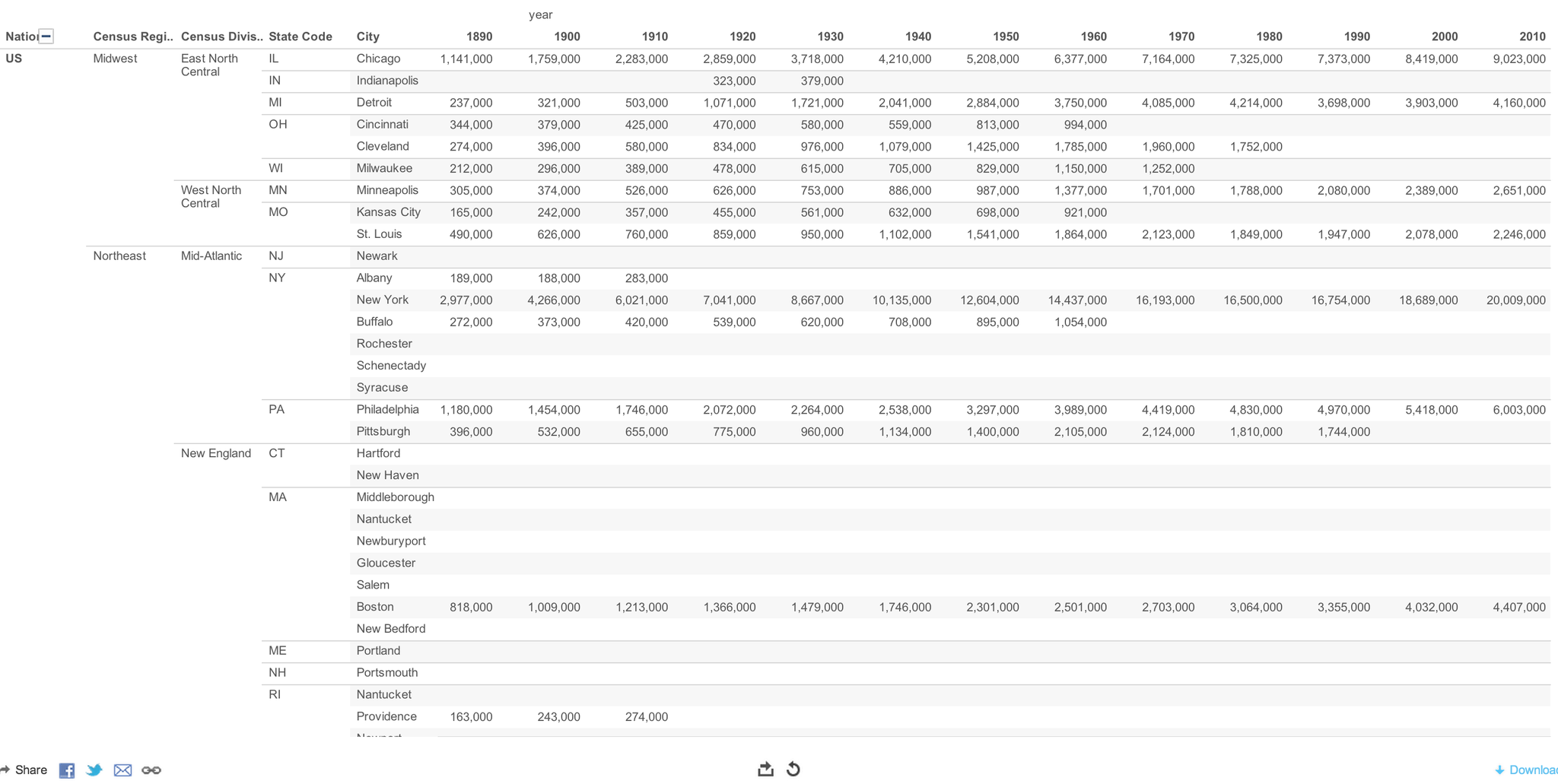
The choice of an approach depends on the time available and the frequency of analysis.In addition, the visualization choices will differ immensely for a business decision makers than for the general public. This attempt leans towards simplicity, speed and clarity versus visually rich complex and dynamic graphs. The aim was to add US regional and state metadata to this city level data.This would provide an ability to assess trends at the state and compare regional population growths.
Prepare
Base dataset:
The City Population data set is from the US Census website.Professor Malecki eased us into the world of web scrapping and data munging by providing a csv dataset.
The uspop.csv is the starting point of this analysis. -Web Scrapper -US Population uspop.csv
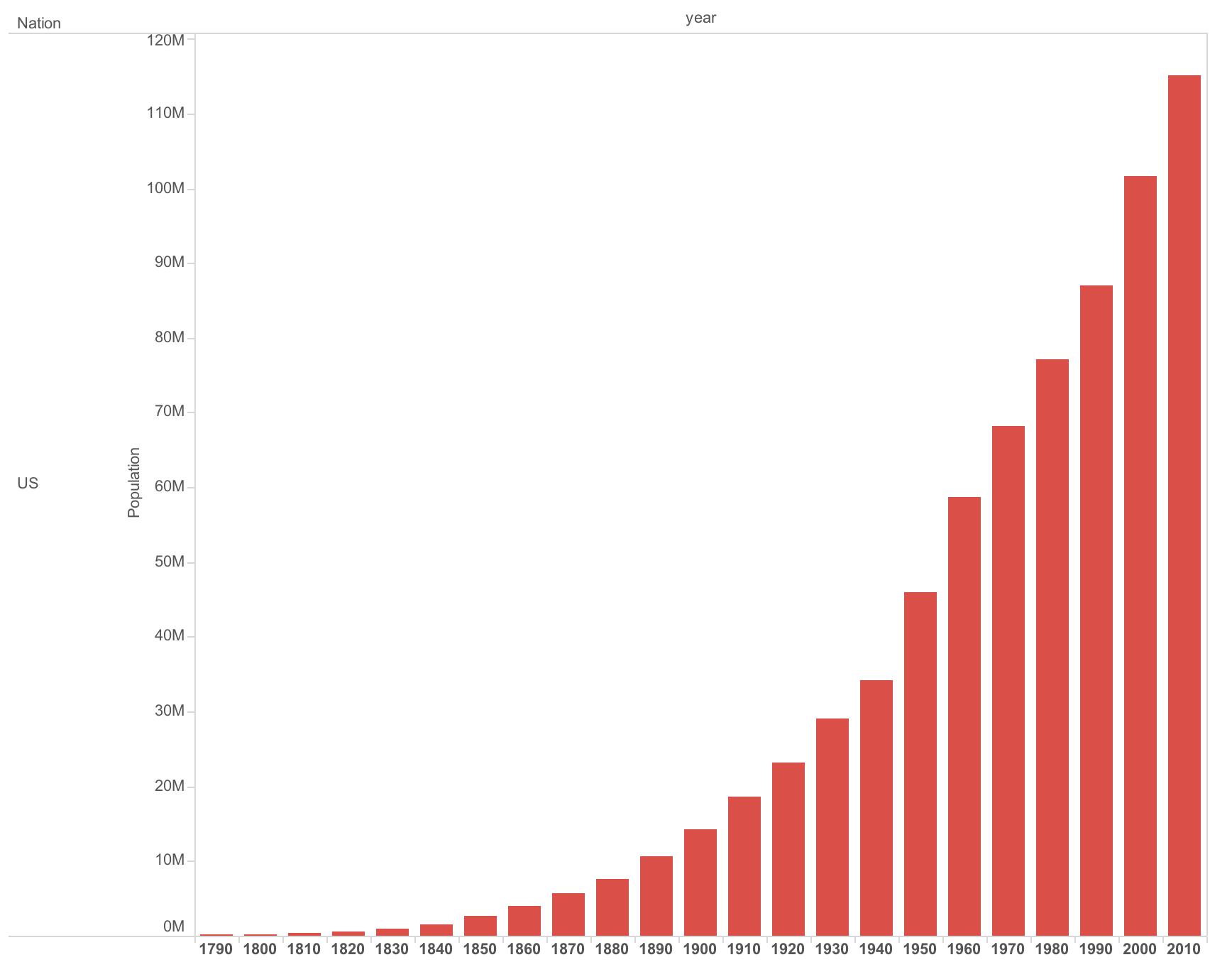
The base dataset ranks (top 20) populations of US cities.This is census data covering a period of 1790 to 2010.Data are not available for all cities for every time the census was taken. There are gaps in the data.
Software and platforms
The following tools were used to support this analysis:
Version control: Github (public on-line repository)
Hosting:Github (local copies of repository and files). Some insights was twitted. The images embedded in the tweets were brought back into this post to avoid issues with asset includes from pull requests.
Data Integration and enrichment: Data Wrangler and Tableau Public
Visualization: Tableau Public
Ancillary data sets: The AdWords datasets available from Google were used enrich the state and regional information. The ZIP data, though available, was not added to the base dataset as it would have been of marginal benefit given the choice of visualization tool (Tableau). The tool provides an easy way to map data to a geography, given that the dataset contains country, state and city information.I assume this is done by inbuilt libraries that already have the longitude and latitude mapped for, at least, the major countries/state/cities.
-DMA Regions and their associated cities
Wrangled Data
Data Wrangler was used for basic clean up.
The base dataset CSV was cleaned for spaces and commas.Some cities were listed with states (Newport, RI).
The state, where existed, was extracted to its own column. This way we didn't loose the orignal state mapped to a city. This came in handy when states were added through other sources for the rest of the cities.
The headings were extracted from the first row. Here is the python code derived from data wrangler for cleaning up the csv file:
Tableau was used to merge data sets.
Regional and State information was added to the city using the AdWords DMA Targeting and Regional datasets.
The AdWords data is global.It was filtered for US and then merged with the base dataset.
- As a biproduct of this process, a reference file on US State to City look up was derived. This can be helpful in future projects and is made available publicly on Github.
Analysis
Once the data is ready, many facilities are available through the tool as far as statistical analysis and visualization are concerned.
I have chosen three simple yet powerful way to visualize data.
The aim is not to prescribe insights and inferences but to encourage the reader to be inquisitive.
The choice of the visualization enables the reader to interact with the data.By providing dynamic controls on sorting, filtering, folding and slicing, the user is encouraged to understand the data at a deeper level. This increases the stickiness of the inference form the data (versus a passive, static graph that prescribes a set of inferences).
-Population Size - Census Region/Division 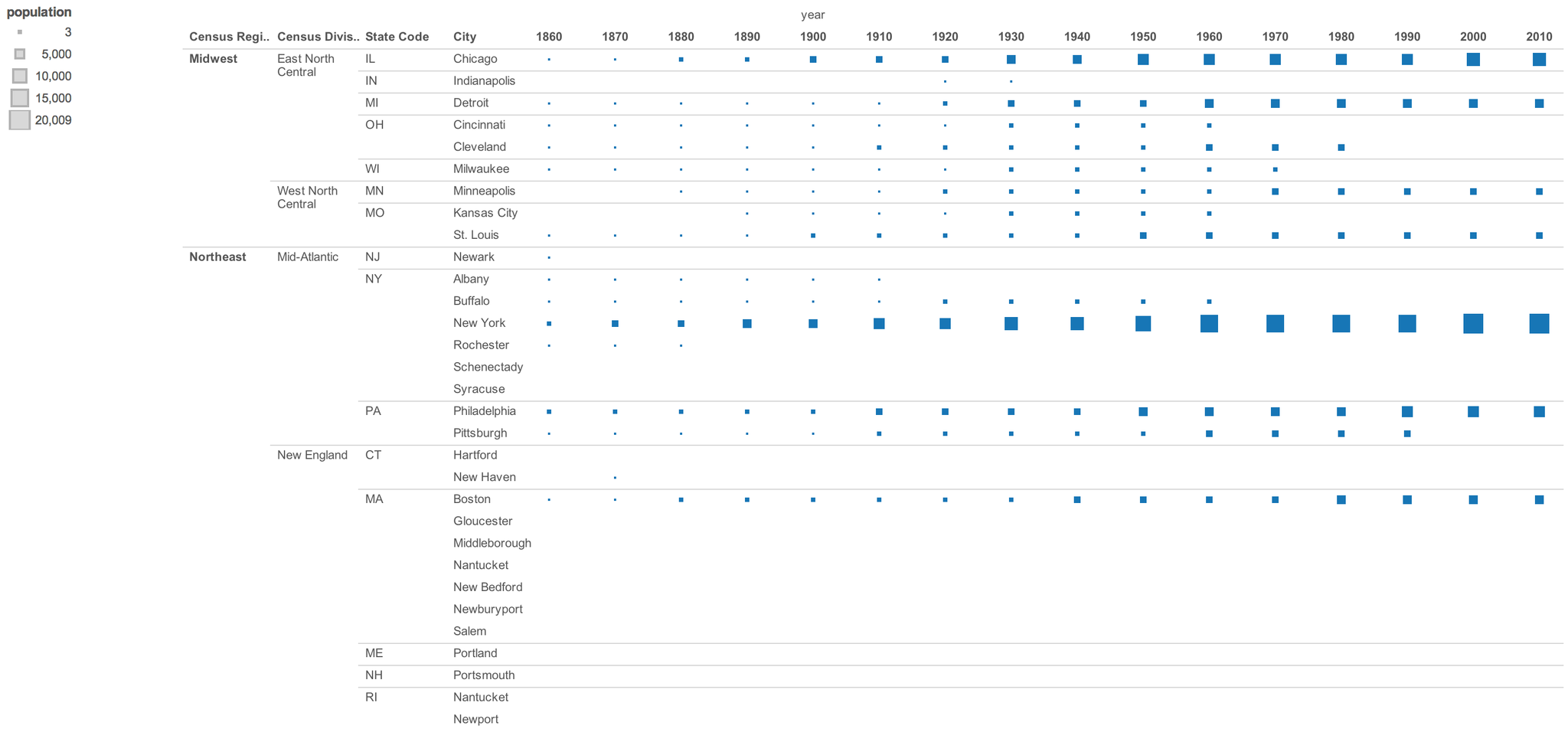
Thoughts Visual display of data is not only for communicating inferences and insights to an audience unfamiliar with the dataset. The more powerful use of visualizing data is as a medium to grasp relationships in multi-dimensional and complex datasets. Network graphs do this exceptionally well. As an example, I have provided my Facebook and LinkedIn social network graphs. Visualizing my connections in this form, I was able to form powerful insights about the way people in my network are connected with each other and to me.
A network graph I created of my Facebook connections is based on Gephi.
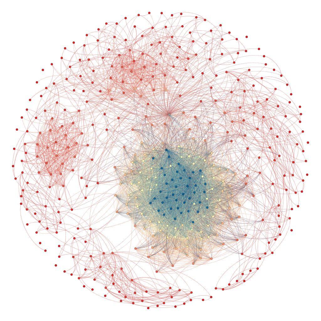 Connections form Taj Hotel, a TATA company, where I worked right after college, holds the center (blue/yellow). The top connections are connected to me through marriage while the right and bottom ones are from where I have lived in the US.On the left are folks I know from work.I also found some outliers... which will be pruned soon...
A similar one for my professional connections on LinkedIn created using the LinkedIn Labs graph app 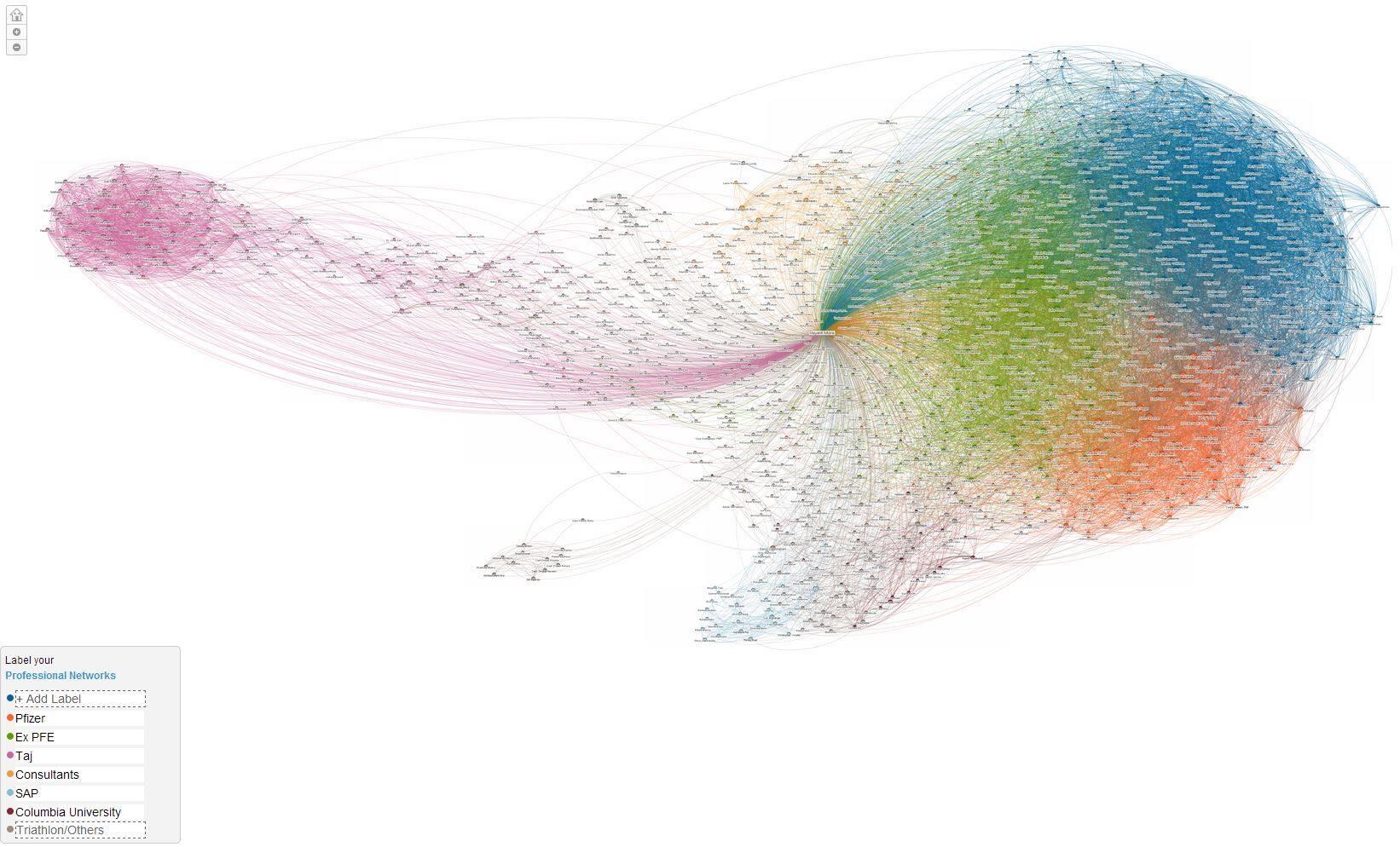 The legend reflects the various clusters in the graph.